Furniture and accessories showroom – S4 design
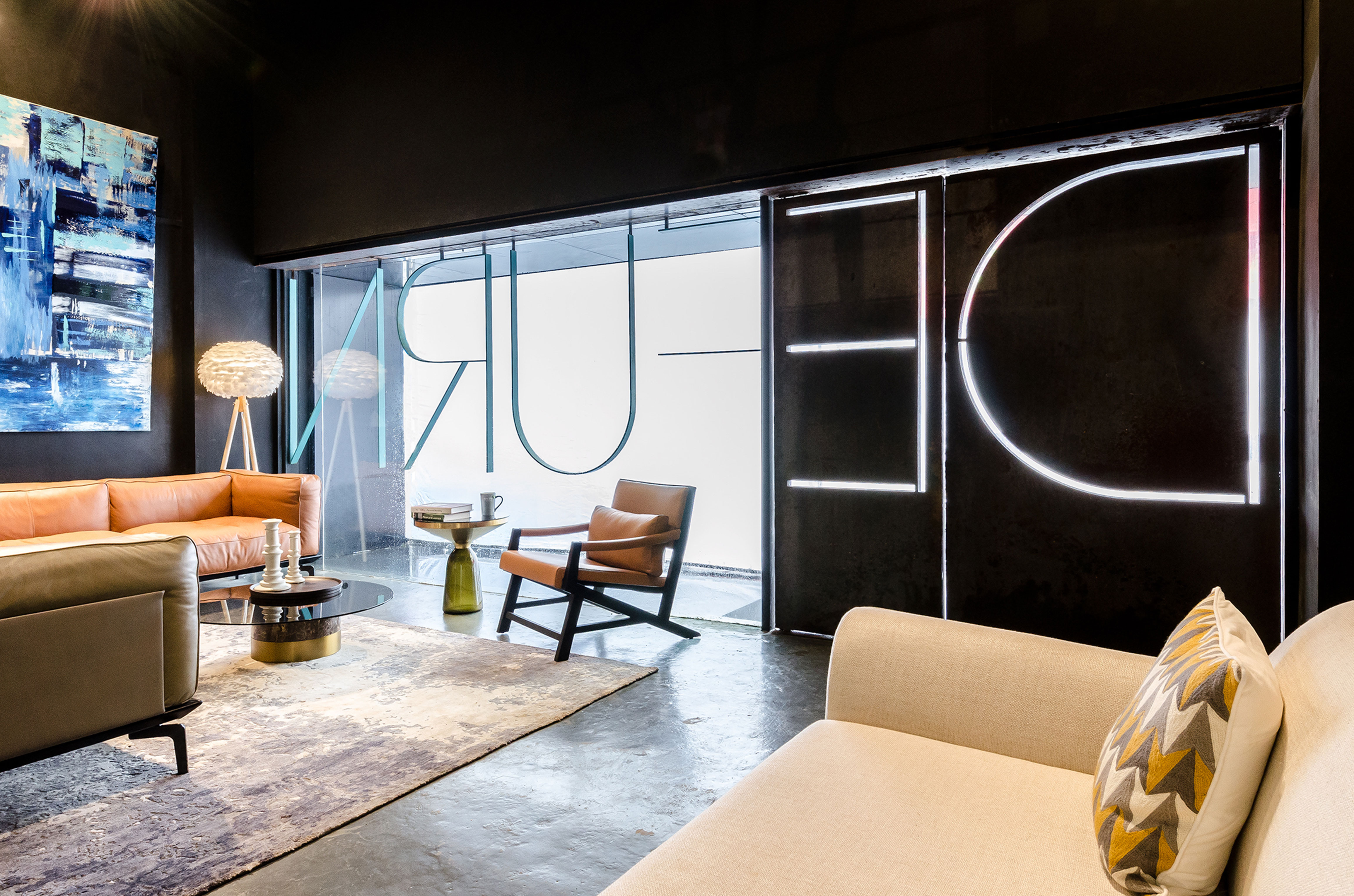
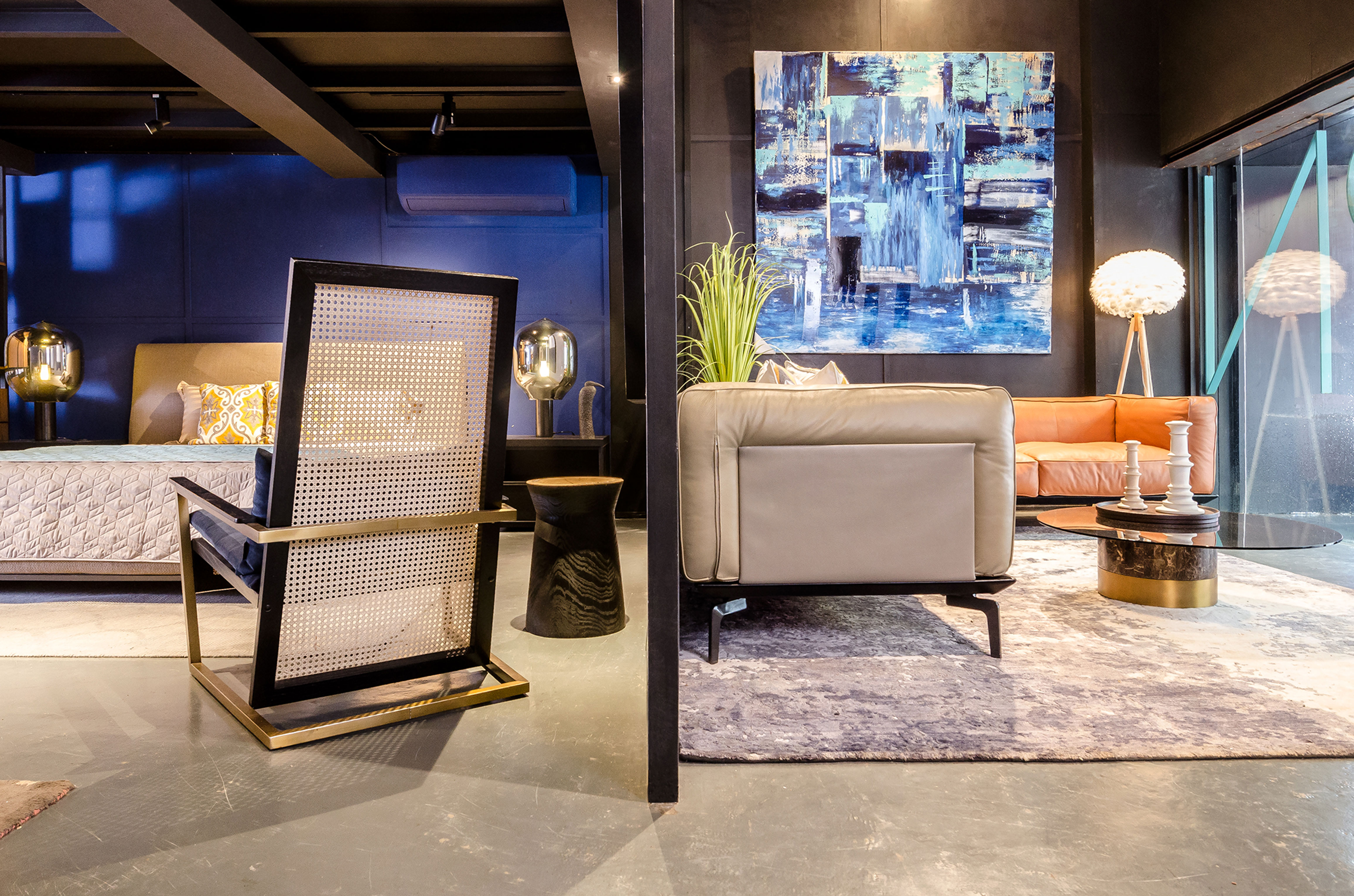
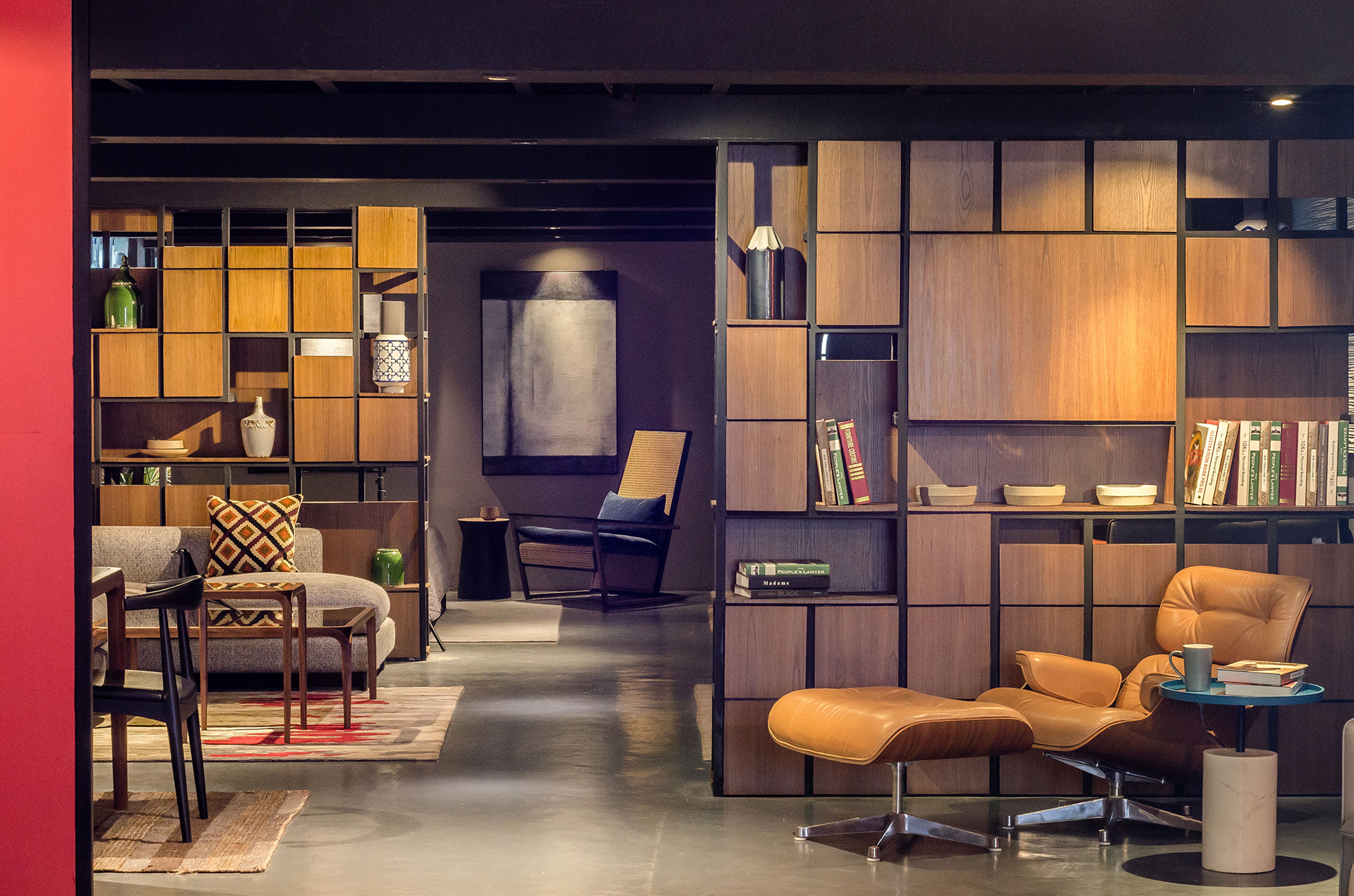
Continuing their branding philosophy from the Mahalaxmi store, we had to create a statement on the façade. Corten took centre stage with the brand spanning the entire store front. A large square panel created a backdrop to the double height display space in the entrance lobby. This panel restricts vision into the showroom. Inside, multiple accessory display units in metal and wood were created to form alcoves for sets of furniture display and create a path for movement. Mezzanine being in 2 parts, we housed the staircase between them, which was hidden behind a chair display unit. A mondrian inspired unit, it houses all the classics in chair design. Multiple categories of displays created throughout the showroom allowed for a wide variety of furniture and accessories to be housed without eating into each others space for attention. Volumetrics were used to create visual axes giving hints of what to expect.
3,000 sq.ft.
Completed
Andheri (W), Mumbai.


